Chuck Close has always denied being a “photorealist”, even when he was making huge black-and-white heads rendered in painstaking detail. It’s a mark of our complacency as viewers that we tend to see anything rendered in a precise, recognisable manner as “realist.” Chuck Close: Prints, Process and Collaboration at the Museum of Contemporary Art is a show that challenges an entire raft of preconceptions. It’s also the most impressive one-man print survey one is ever likely to see.
There are two, equally important strands to this exhibition, which has been put together by Terrie Sultan, director of the Parrish Art Museum, New York, with Sydney’s Glenn Barkley as the co-ordinating curator. Not only is this Australia’s first-ever survey of the work of a major American artist, it is a revelatory display of the scope and power of an underrated artform.
Born in 1940, Close belongs to the generation that arrived in the wake of Abstract Expressionism, which was the dominant influence on his student work. Although he was born and raised in the north-west, he attended the prestigious Yale MFA course at the same time as artists such as Richard Serra and Brice Marden. By the time Close finally settled into the obligatory New York loft and lifestyle, it was 1967, and even Pop Art was looking like last year’s hemlines.

Close knew he had to do something different to stand out from the crowd of hard-edged abstractionists, minimalists and Pop artists. After an experiment with a 6.7 metre-long nude, he settled on the human head as his defining subject. Although it is impossible to make such paintings without referring to a model, Close has habitually referred to his works as “heads” rather than “portraits”. He was not aiming to make a portrait, with all its conventional psychological associations, but a work as flat as any Color Field abstraction. The subject was only incidental to the process.
These works made no attempt to disguise their photographic origins, but there was never any specific engagement with the medium. What Close liked about photography was the way it enabled him to fix an image in time – the subject wouldn’t age, grow fatter or thinner, or cut their hair. He was painting a photograph rather than a person.
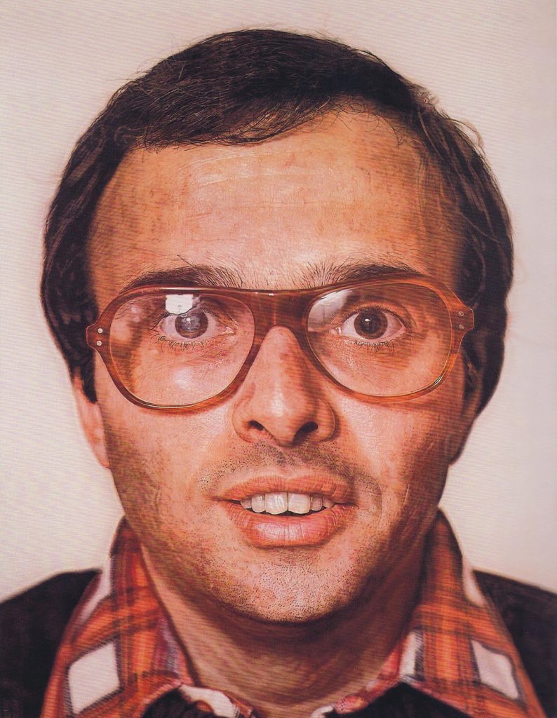
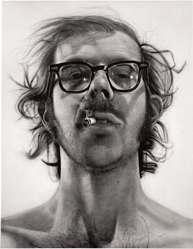
The first of the heads was a massive self-portrait showing the artist with shaggy hair, and a fag stuck dismissively between his lips. Another early work was Bob (1970), acquired by the National Gallery of Australia in 1975 only two years after Pollock’s Blue Poles entered the collection. Like that controversial masterpiece it has proved to be one of director, James Mollison’s more prescient acquisitions. He also purchased the progressive mezzotint, Keith/four times (1975), Close’s first foray into printmaking. Painting and prints are both included in the MCA exhibition.


Close arrived at his method partly as a way of overcoming his facility with the brush, partly as a corrective to a physiological problem. He suffered from dyslexia in an era that had limited understanding of learning disabilities, but also from a condition called prosopagnosia, which meant he had difficulty recognising faces. By freezing a face photographically he rendered it user-friendly.
These disciplines would become crucial to Close when he suffered the catastrophe of his life. In December 1988 he was paralysed from the shoulders down by a spinal artery collapse. This would probably spell the end for most artists, but Close regained limited movement in his arms and began to paint again with a brush strapped to his wrist. For the past 25 years he has worked in this manner, applying paint to faces that have been gridded up and transferred to large-scale canvases.
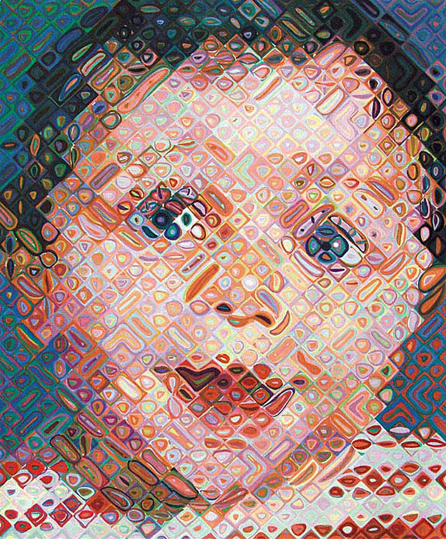
Over this time his work has become increasingly inventive, as he has treated each small square as a field upon which he can experiment with form and colour. In 1970 Close’s paintings were large-scale facsimiles of black-and-white photographs, today they are mosaics incorporating thousands of coloured dabs and dashes. With the impairment of his overall mobility he has rediscovered the painterly gestures once banished from his repertoire. The grid remains the foundation of his approach, and each work proceeds with agonising slowness, square by square.

Today Close must be the world’s most successful and prolific ‘disabled’ artist. It’s hardly an appropriate word, as he has stubbornly transformed his disability into a creative opportunity. He owes a debt to a personality trait inherited from his mother, that prompts him to go against the grain of his natural inclinations. If he feels he is “lazy, slobby and indecisive”, as Richard Schiff writes in a catalogue essay, then he “volunteers for new habits.”
Although Close claims to be impatient, he has worked – at first by choice and now largely through necessity – in the most slow and fastidious manner. It’s a discipline that many able-bodied artists would have done well to emulate. (Brett Whiteley springs to mind!)
Depending on the complexity of the task, print-making can be the slowest of all mediums. In Close’s hands it has become an arena for staggeringly complex innovations that have required the assistance of master printmakers such as Joe Wilfer, Donald Farnsworth and David Lasry. Being confined to a wheelchair Close has had to use assistants for many tasks, and this seems to have inclined him towards printmaking as an activity that entails a genuine creative collaboration between artist and technician.
Prints are often viewed as merely a secondary art, hardly more than a commercial spin-off from painting. In pre-photographic times it was commonplace for a famous painting to copied in the form of an etching or engraving and given a wide, popular circulation. J.M.W. Turner made a healthy income from the sale of prints. Bartolozzi’s print based on Webber’s The Death of Cook, was the best-seller of the Romantic era.
Close takes a completely antithetical approach. The print generally comes first, and may take considerably longer to finish than a painting, especially if it generates a range of problems that need to be solved along the way. The lessons learned from these processes are fed back into Close’s paintings, refining his understanding of colour, texture and composition.
Many painters enjoy turning their hand occasionally to lithographs or etchings, usually one or the other. Close, however, has ranged so extensively over every kind of printed media it’s almost impossible to follow the changes. He has made prints on pulp paper, he has used stencils, silkscreens, fingerprints, linocuts, handstamps, embossing, laser prints, and obscure techniques such as watercolour pigment printing. Georgia (1982) was made by an accretive technique – putting together many different fragments of paper until a face appeared. The composition was recorded on a carefully drawn stencil, and run through a press.

Close has experimented with archaic photographic techniques such as dageurreotypes and Woodburytypes, and had images made into large-scale tapestries. If you want to know what a Woodburytype is, you’ll have to see the show. It would take a page to describe the process.
While Close might produce an etching, it is never a simple drawing on a plate. A small self-portrait of 2004 is constructed from nine separate states made with coloured pencils and copied by a laser. Many of his prints are hybrids of two or more techniques, the killer being Alex/Reduction Block (1993), an impossibly detailed silkscreen that began life as a linocut, and required massive ingenuity to rescue, after everything went wrong at a printing press in Wisconsin. The centerpiece of the show is the set of 14 separate states the print went through. It’s a landmark of the printer’s art.
One rarely sees any artist working in such an intensive manner, with or without collaborators. The amount of concentration involved, not to mention the hours of repetitious labour, would be unsustainable for the vast majority of people. Close’s intensity of focus invites a reciprocal intensity in the way we address this exhibition. It’s not sufficient to walk past and cast a glance at a picture, one really needs to stand and look hard. It may seem at first that you are looking at a face, but it soon becomes clear that each work is a document of a mind-boggling process. The wonder is that something as neutral as a ‘process’ can be so inspired.
Chuck Close: Prints, Process and Collaboration
Museum of Contemporary Art, until 15 March 2015
Published in the Sydney Morning Herald, Saturday 22nd November, 2014